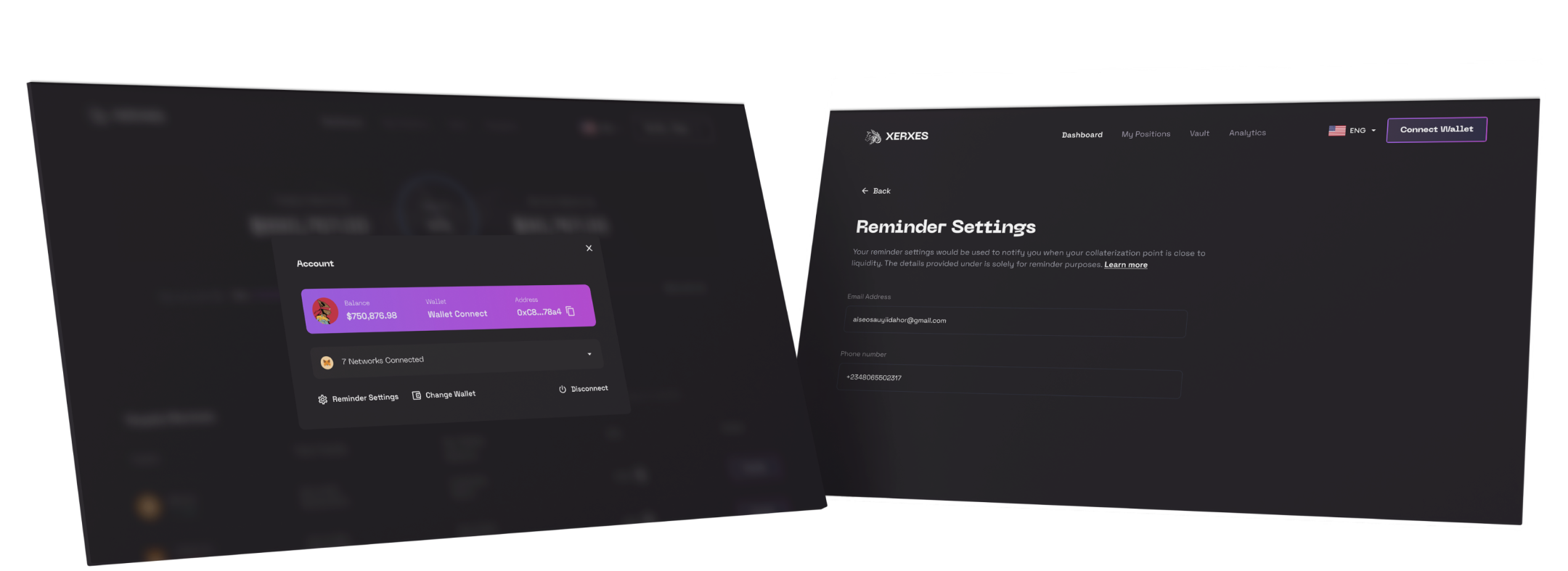
Multi-Asset Management Dashboard
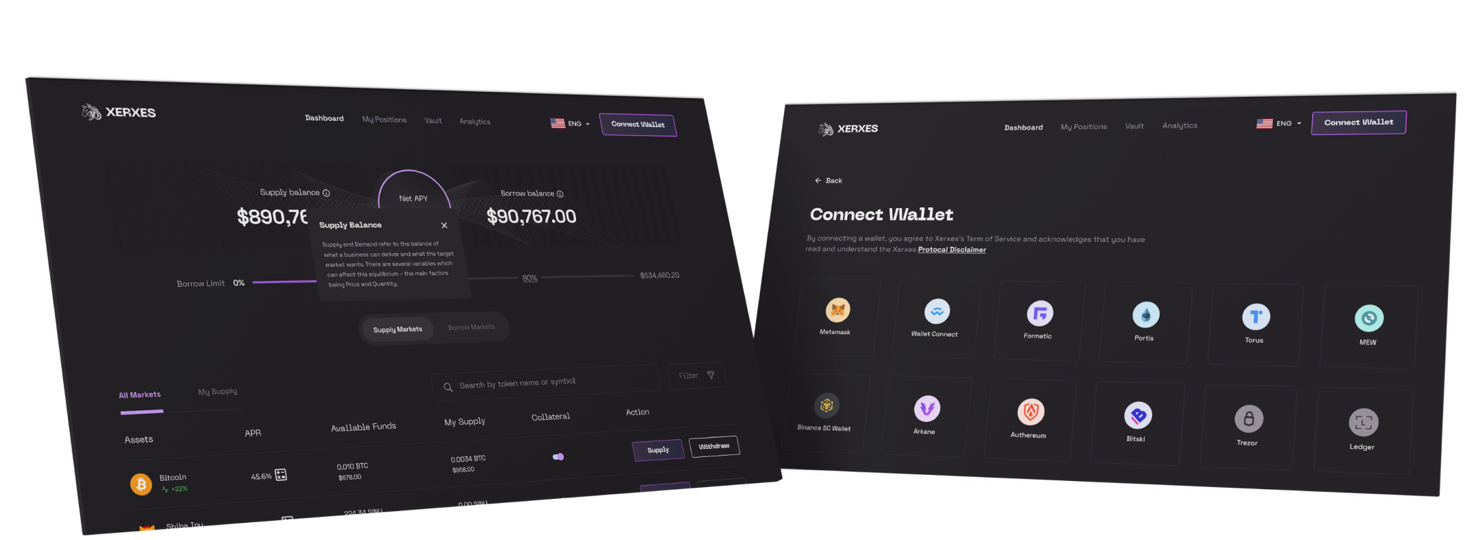
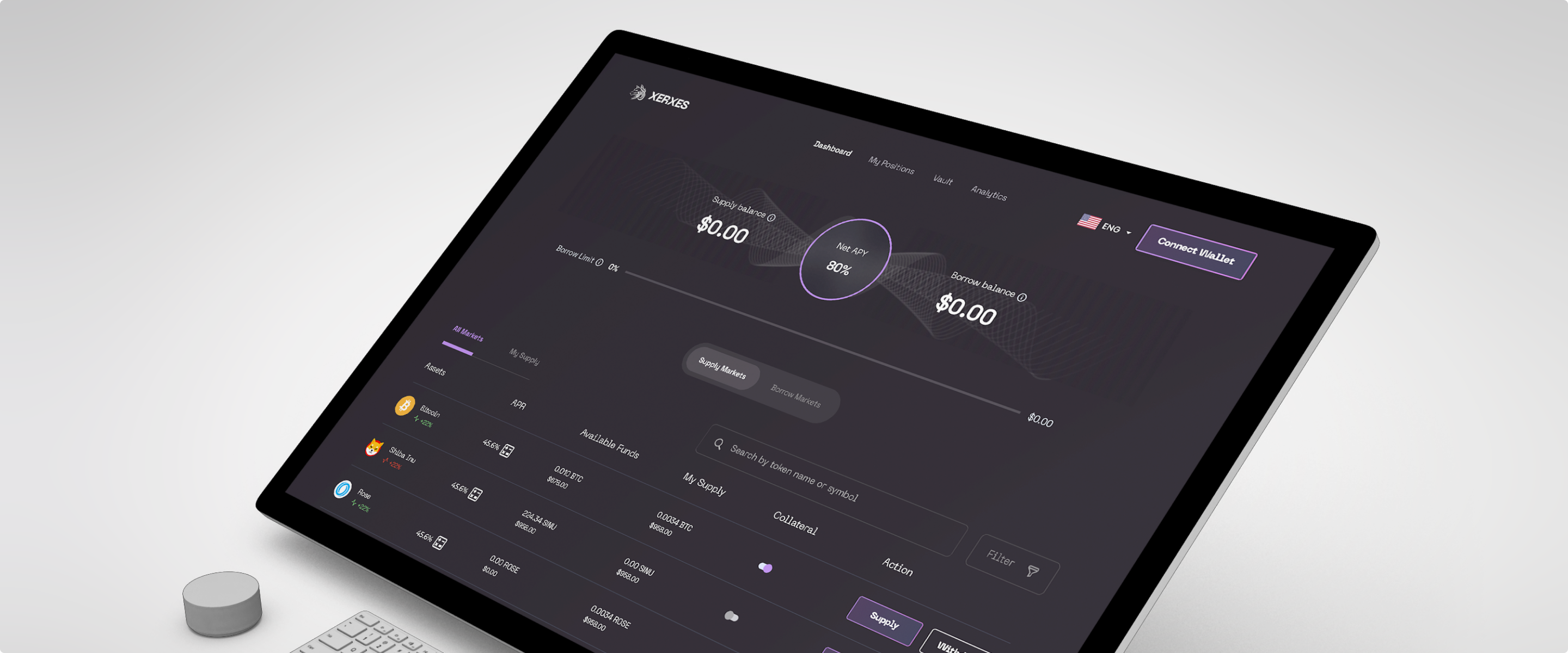
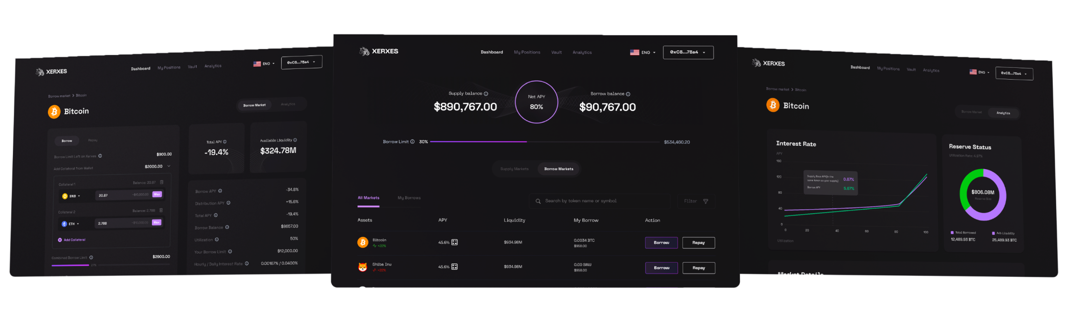
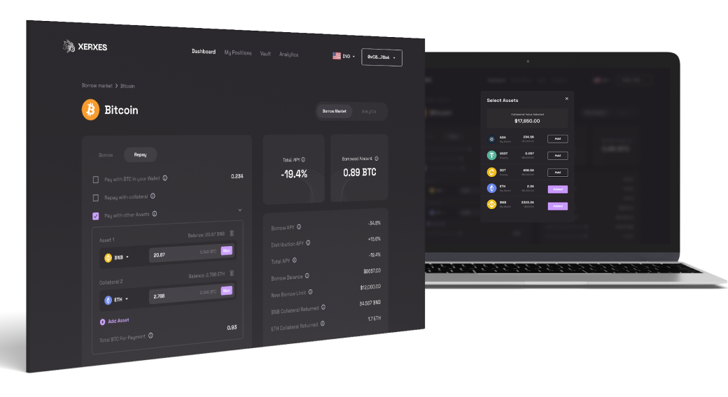
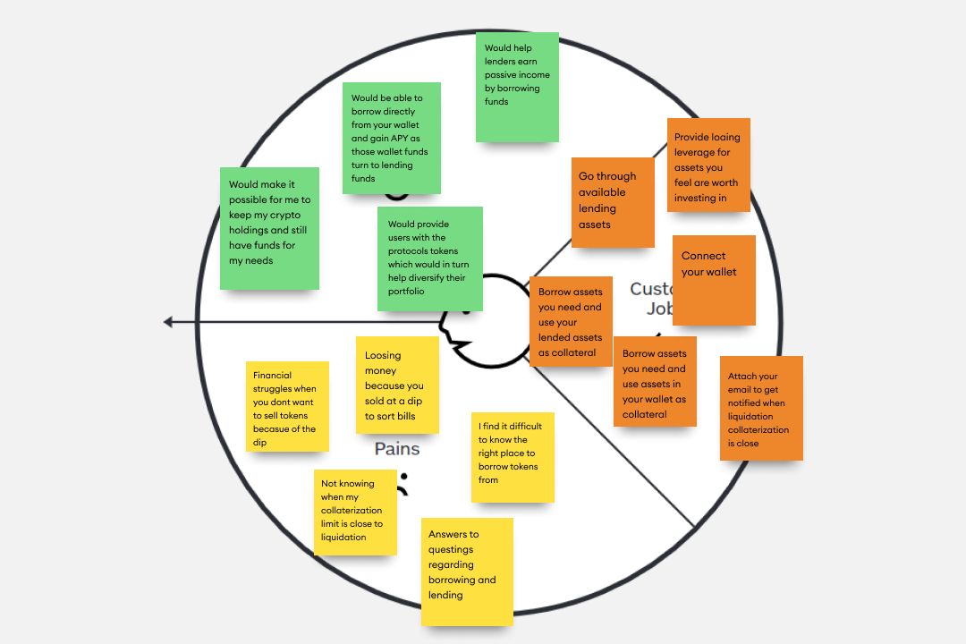
DeFi users often feel "lost in limbo" when navigating multi-asset portfolios, struggling to distinguish between their total wealth and active debt. To solve this, I moved away from static data tables and designed a dynamic Consolidated Portfolio View.
My approach focused on Visual Hierarchy, surfacing the most critical KPIs, like Net APY and Total Value Locked, at the very top to facilitate quick scans. I implemented a "drill-down" architecture where users can tap into specific assets to see historical growth charts, effectively turning a "black box" of data into a clear story of financial progress.