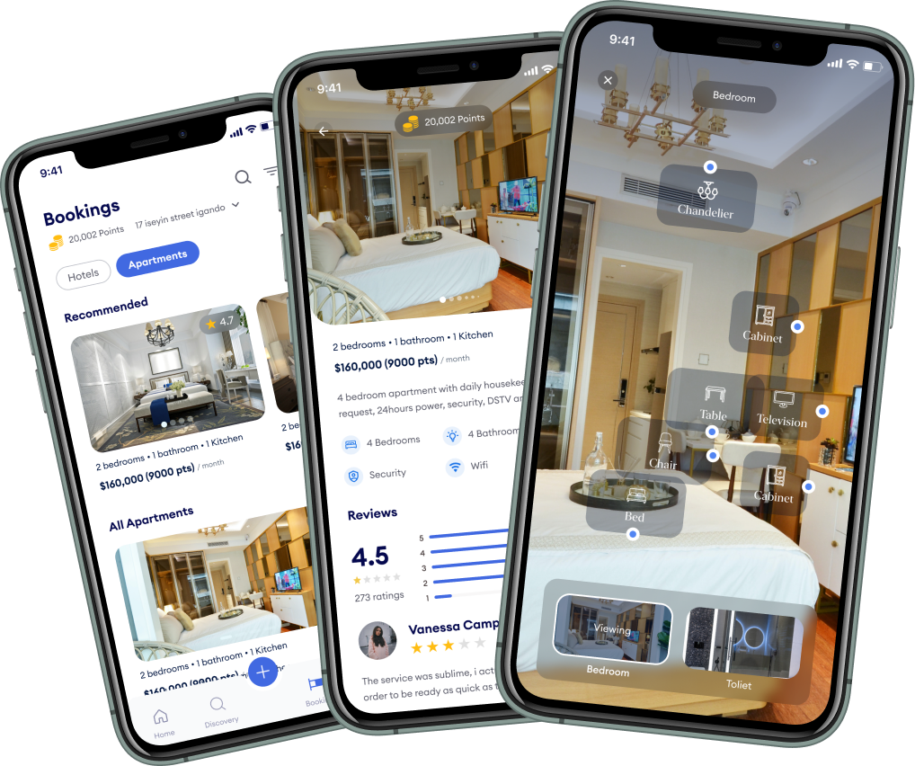
AR travel planning that feels like flipping a postcard, not querying a database.
Travel apps lose users in the planning step because the screens look like spreadsheets. Layering AR over physical maps and locations made the bridge between 'planning' and 'being there' feel continuous, not transactional.
If it shipped, the things to watch:
- Average time spent in the AR preview before bookmarking a place.
- Bookmarks per trip and how many converted to actual trips.
- Repeat use after the first trip. Does it become a habit.
Two usability rounds said the metaphor worked. The company pivoted before we got to launch. The case study stands as a record of the design decisions, not a product to open.

